


Forbes’ Deceptive Gender Pay Gap Statistics
And what they tell us about the reporting of gender issues


“Despite the push for equal pay for equal work, women continue to earn less than men in nearly every occupation, from entry-level positions to the C-suite.”
That is the conclusion of a report on the gender wage gap published earlier this year by Forbes. It’s a rather definitive claim. Yet the data they present does not appear to support that claim, despite their efforts to make it appear that it does. So let’s take a look at how this and other reports often distort the pay equity picture.
Most of us are familiar with the often-quoted statistic that women earn 16% less than men today, or $0.84 for every male dollar. That number is up from $0.59 in 1963, and $0.77 in 2010. But what most of those who quote these statistics fail to point out, is that those numbers reflect the overall median earnings for men and women throughout society. And back in 1963 that imbalance was generally the result of such factors as men being doctors and women being nurses, with doctors naturally having higher salaries.
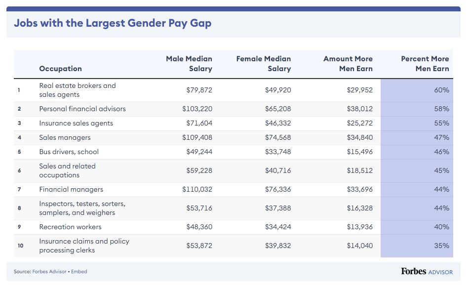
And the fact that the pay gap has narrowed so significantly since that time, undoubtedly reflects the fact that women have moved into professions which were once exclusively male – and in ever increasing numbers. So why is there still this disparity of 16%? That is the question often asked by those who misuse the data – such as in this chart from the Forbes report:
And those who misuse the data for political reasons, generally argue that the pay gap is a result of sexism, misogyny and patriarchy, without offering any proof of those claims, or any consideration of other less damning possibilities. But these numbers from Forbes reveal that there is another possibility – one that conveys a very different story, which Forbes seems reluctant to tell. So let’s take a moment to explore what is going on here.
We get a sense of where this manufactured confusion is coming from in the preamble to the report, where the authors define two types of wage data. “Uncontrolled” wage data, is that which does not account for “job title, experience, education, industry, job level and hours worked” – the kind of data represented by the numbers quoted above. Whereas “controlled” data accounts for the impact of all those factors. For example, the preamble later goes on to state that, when using “controlled” data, the wage gap between men and women narrows to just 1%.
Which should be good news to anyone concerned with inequality. Because it essentially says that there is no inequality, certainly not in terms of wages.
But when we reach the meat of the report, where the bulk of the pay gap data is presented – by industry, job title, geography, and demographic group – the gaps suddenly balloon, such as in the chart shown above. In fact for some jobs the report shows that men earn as much as 60% more than their female counterparts. So why is that?
Clearly that must be because the report is quoting “uncontrolled” data. I say “must be” because nowhere does it explicitly say what data they are using.
And though it is clear to me that this is what is happening (having studied the data more closely), it does nonetheless require the reader to note the discrepancy between the data presented in the meat of the report, and the more accurate and relevant “controlled” pay gap reported earlier of just 1%.
Because having seen numbers showing pay gaps sometimes in excess of 50% for men, and none of them reporting an advantage for women, it is mathematically impossible for there to be a total “controlled” pay gap of only 1%. Which means the pay gaps they present throughout the body of the article are clearly calculated using “uncontrolled” data.
Why does Forbes force the reader to go through these mathematical gymnastics to find out what is going on, when they could have easily stated that fact up front? And why is it that the report is almost entirely concerned with “uncontrolled” data, which common sense tells us is much less indicative of the differences between men and women?
The only logical conclusion is that “uncontrolled” data was used because it looks more damning, and supports the claim that women are getting a raw deal in the workplace. Which would mean that Forbes has gone to great lengths to avoid telling its readers the truth – to the point of making it unlikely for the average reader, casually perusing the data, to realize what the numbers actually convey.
Another aspect of this article which leads me to suspect deception, is the fact that the only other occasion in which “controlled” data is presented, is in reference to the “c-suite,” where it reports the pay gap to be 5%. It could be that the inclusion of this additional bit of “controlled” data results from the fact that Forbes likes to present itself as a resource for executives (and those who would like to become executives). And while that may be their target audience – judging by the presentation of the rest of the data, I would argue the true reason they chose to give us this c-suite number, is because it represents the widest gap between men and women they were able to find.
And given that they seem to have a complete set of “controlled” data, why do they not report that data for the dozens of other categories they describe? Is this choice purely a matter of a news organization wanting to report the most dramatic news? Possibly. But there are plenty of reasons to suspect that Forbes is intentionally offering us a slanted view for political reasons. Even their use of the word “disparity” to describe the wage gap has negative connotations, owing to its more recent association with “inequality,” as opposed to its older, more neutral meaning of “a great difference.”
And throughout the article the author describes wage disparity as a “problem,” and uses words like “only” and “just,” as in “women make just 25%,” and that the gap is “still present,” and that the average woman “stands to lose” – as though it were a economic crisis, rather than a common sense fact, not to mention one that should be celebrated. Given that women now receive “equal pay for equal work” – which the 1% number tells us is essentially the case.
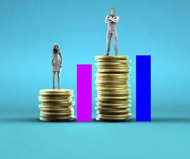
And then there is the cover photo, which depicts a man posing triumphantly, even haughtily, over a massive pile of coins, standing well above the woman next to him, who slouches dispiritedly on a stack of coins which is considerably smaller than the man’s. When in reality her stack should be indecipherably smaller than that of the man, or at the very least 84% of it (even if you use “uncontrolled” data). In which case here’s how high the piles would look:
So why is this bias important to point out? Because real people see reports like this one and form real opinions and make real decisions based on them. In fact I first encountered this report when a woman, attempting to explain to me how poorly women were being compensated, did not realize that the numbers actually show a miniscule wage gap between men and women.
And I can not tell you how many times I’ve read or otherwise been presented with this kind of deceptive “uncontrolled” data. And I know others have run into this as well. How could they not, when this is the only way the media seems to report on this issue?
But these are the facts. The pay gap between men and women has virtually disappeared. And that should be celebrated by us all – especially women.
For more adventuresome reading, check out my novel. And tell your friends.
The Contrarian Candidate is a high-stakes political thriller about our fraught and turbulent times.

Bartholomew St. James is a one-time political operative who’s turned his talents to reporting on the politics of our day. And he’s done it with fiction, because he feels that’s the best way to tell the story of a deeply divided nation and the challenges that presents.
He’s also the author of The Progressive Contrarian on Substack: Providing common sense answers to complex questions, by seeing the world through contrarian eyes.